OverView
Project Duration
January 2022 - February 2022
My Role
User research, prototyping, UI design and building a maintained design system art direction and brand design
01
Set The Stage
The Problem
Many coffee companies focus on fast money and growth when they should be focused on sustainability to aid against global warming and help infrastructure in rural areas that are growing the coffee.
The Goal
The goal is to educate people about stenophylla (a type of coffee) and the positive impacts it has on global warming.

How is coffee agriculture affected by global warming?
rising temperatures will reduce the area suitable for growing coffee by 50% (click to read .
What impact does coffee have on the
environment?In the worst cases, coffee processing plants can
discharge waste into rivers causing pollution affecting the water systems, killing wildlife and disturbing ecosystems.
EMPATHIZE & DEFINE
RESEARCH COMPONENTS
Market Research
Problem Statement
Pain Point
Personas
User Journey Maps
02

User Research
I conducted interviews so as to understand the likely pain points of users, their needs, and behavior so as to avoid implicit bias or any bias for that matter. I interviewed 14 adults who are coffee lovers age demographic from 19–60.
-
Where do people usually buy coffee?
-
What are the main important aspects when picking a coffee?
-
How interested would people be in expanding their knowledge of different coffee types?
Base On InterViews
10
6
Flavor
Are interested in the quality of the coffee
It is the main reason of choosing the coffee
Buy Coffee from
their local supermarket
User Research: Pain Points
O1
Inability to have a selection of coffee customize the way they want.
03
Recommendation not tailored to a specific interest.
02
Don't have the option to try coffee before purchase.
04
Inability to choose variation of the coffee.
Persona
I use my interview to come up with this persona to represent the target audience

"I work Long hours from home I love the fact I can have some time to enjoy a good coffee with no worries of uncertainties "
John
Simms
Frustration
-
lack of resources about grind coffee being marketed.
-
Have to do extensive research to find options to buy coffee.
-
Wants to buy coffee don't know where to start
"THERE'S NOTHING LIKE STARTING YOUR DAY WITH A FRESH BREW OF COFFEE! IT MAKES ME FEEL LIKE I WILL HAVE A PRODUCTIVE DAY!"
I love coffee I use to buy capsules but realize all the additives that are added are not healthy. Then one day i travel to Italy and had no choice but to try Primula Stovetop Espresso and Coffee Maker. Boy! my taste buds were in heaven and I never look back !!! Now I am well knowledgeable when it comes to grinded coffee . I never buy coffee online ever since!
Motivation
-
love to drink coffee for a pick-me-up mood.
-
I value dark and strong coffee.
-
Open to trying new flavor
PROBLEM STATEMENT
HOW CAN WE ADVERTISE AND MARKET-FRESH BAGS OF ORGANIC COFFEE TO MAKE
SURE CONSUMERS ARE AWARE
AND FIND IT ACCESSIBLE ONLINE ?
User Journey Map
To understand how customers find and interact with the service I created a User Journey Map.

visualization of the process that a person goes through in order to accomplish a goal.
IDEATE
03
RESEARCH COMPONENTS
Competitive Audit
Site Map
Paper wireframes
Digital wireframes
Low-fidelity prototype
Usability studies
C o m p e t i v e A u d i t
Am I solving the right problem?
Before I start the project, I need to make sure I’m solving the right problem. To do that, I conducted a competitive analysis on Nespresso, Chamberlain, and Senseo
all 3 brands advertise differently and target different demographics.
From the market analysis, of The Coffee Project, the service and the product it offers are placed in the high-quality range.
I took a quantitative approach I look at app stores to see what consumers were saying and put repetitive quotes to describe experiences.
Desktop website experience
Mobile website experience
Navigation

Great
+ Visually appealing
Outstanding
+ Fully responsive
+ Animations added to enhance the mobile experience - The menu is hard to read
Outstanding
+ Very easy to navigate
+ Familiar way to navigate (e.g., swipe)

Good
+ Visually appealing
Good
+ Fully responsive.
- Interaction was not as smooth on mobile
Outstanding
+ Easy to navigate + Clear indication of clickable elements

Okay
It-Terrible to navigate and find information
- Feels dense and overwhelming in places
Okay
- Not responsive
- Menu is hard to read
Okay
- Somewhat difficult to navigate
- Some elements seem clickable but are not
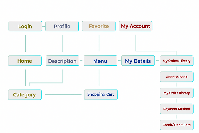
S I T E M A P
Grouping the below features and establishing the user flow
Flow 1 - Login, Profile, Favorite, and My Account
Flow 2 - LOG IN, home, and category - Shopping Cart
Flow 3 - FAVORITE, and Menu
Flow 4 - My Account, My order History, Address Book, My Order History, Payment Method, and Credit/Debit Card
When starting I had the basic importation part for navigation accessibility then as I continued with my Prototype user was faced with constraints. I decided then to make a complete interface process that accounts for all of the processes to complete the order done. Finally, I ended up with about 17 screens.
Generating Design Solutions
TESTING EARLY
I created a paper prototype using InVision and began my first usability testing. Using severity rating to rate the usability issues on my initial design, I made the necessary adjustments and moved on to mid-fidelity wireframes.
Paper Prototype
Low-Fidelity Prototype
My low fidelity was inspired by my crazy 8 it is not the finalization but it gives me a visual structure of the Ai.


Digital Wireframe
Mid-Fidelity Prototype
I created a low-fidelity prototype using these wireframes and was able to have some users test it out. After receiving feedback and implementing some changes to the wireframes, I moved on to the design phase.

High Fidelity
High-Fidelity Prototype
After creating a Mid fidelity prototype after seeing the full results I decided to make some more UI changes in consideration of AI.

Usability Study: Testing
4 participants tested a hi-fi prototype. They were tasked
with finding how to purchase and select coffee.
1. 190% of the participants were able to:
a. locate a coffee selection
by scrolling
b. identify the description of the coffee
c. identifies the origin of the coffee.
2.100% of the participants understood the
navigation.
3. 100 % of the users had difficulty with the
search and filter functionality.
4.100% of the users could identify how to create a Profile entry.
Usability Study: Parameters

Study Type:
Unmoderated Usability
Study
Length:
40min

Participants:
4
Location:
Remote, United States
Overall reaction to the AI

1
"Log in Process is a great
start just taking
concentration on margin
and Distances.
2
"Home screen they are
Search on the top and one
At the bottom what is
going on with that?"
3
"I category screen
hamburger menu does
not belong they're especially
when checking out."
Log In
"Log in Process is a great
start just taking
concentration on margin
and Distances.
Home Screen
"Home screen they are
search on the top and one
in the bottom what is
going on with that?"
Selection
" Selection screen
hamburger menu does
not belong they're especially
when checking out."
PROTOTYPE & TEST
RESEARCH COMPONENTS
High-fidelity prototype
Mockups
Accessibility
UI Design
04
High Fidelity Wireframe
High-fidelity
prototype
The High Fidelity prototype followed the same user flow as the low-fidelity prototype. I included design changes that were made after the usability study.


Here are the testing insights for each concept that was tested:
Mockups
Categories Screen
From Low fidelity compared to High fidelity in my final results, I decided to keep the category page simple instead of adding promotions I wanted it to focus just on what coffee offers are available.
Challenges And Insights
It was brought up that maybe a toolbar made more sense moreover than a hamburger menu. I am still working on the final draft of how the toolbar will be implemented.

Motion animation
video everything is reactive

Description Screen
Based on the insight from usability studies, I applied design changes like providing a back button so it can be easy to navigate back to the category and rearrange selections to add to the cart.
Spark Insight
I Played a lot with the selection part of the Ai I did some UI research and my initial design was not appropriate for how coffee bags was being marketed on another website.
Accessibility Considerations

Clear labels for interactive elements that can be read especially for account details and check out.
Readable fonts and black text for profile, checkout, and receipt.
Initial focus on Category screen having less advertising and focus more on purchase
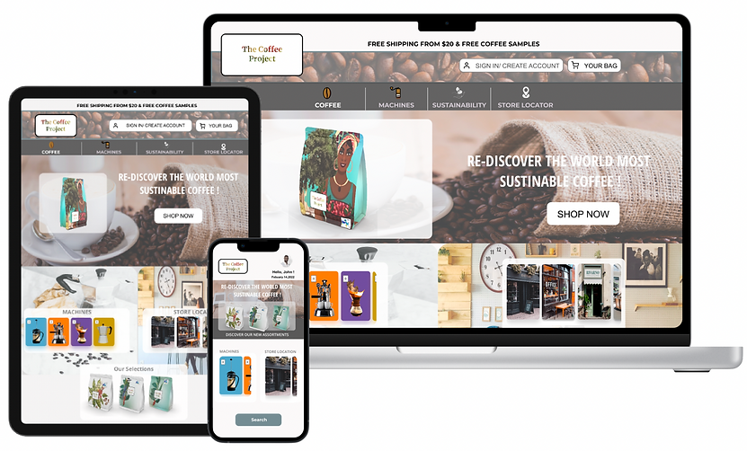
Responsive Designs

Desktop iPad iPhone Design
The design for screen size variations includes desktop, tablet, and mobile. I optimized the design to fit the specific user needs of each device and screen size to aid with accessibility.
Onboarding Parallax & log In
Onboarding Parallax
To symbolize Sierra Leone I use an illustration of the beach and I use the national bird flying over the sea.
Fig.1 Luis Alvarez.Yoff(2017)illustration.
Fig.2 Max Rinaldi.Fly Me To The Moon(2014)Image.
05
Designs
For the first 3 implemented my design skills using images that are inspired by Sierra Leone's historic landmarks.
-
the first design is inspired by the mother of Sierra Leone associated with mother earth. The cotton tree is a symbolic tree that has been up since slavery existed in the capital of Freetown.
-
second is a fisherman holding the Sierra Leone flag in a traditional boat.
-
last is the national bird of the Sierra Leone national bird White Throated Bee Eater.
Fig.3 Angelikad.African woman with a basket harvests arabica coffee berries.illustration.
My Personal Connection To This Project
This project is more personal for me. As I venture to take a humanitarian path of trying to build Livelihood for villages in Sierra Leone. My research was to make close connections with agaricologists and anthropologists to learn a lot about stenphillya and how it can help not only the villagers and farmers but how it can aid our planet against global warming.
Design Sprint Impact & What I Learned
-
While working on this case study I felt I would know and resolved most of the constraints by being mindful of constraints I had with other apps I also went and review my favorite apps to see what can be resolved and what I realized is that users actually had constraints and the user come first.
-
I learn that no matter how creative I am… I always need to work in the mind of references to other apps that users might use, mostly references to the popular apps.
Completing The Design & Next Step
-
Continue to do research interface hierarchy.
-
There is always room for improvement and there is always more to add, my work isn't finished!
Go Back To Previous Project...

